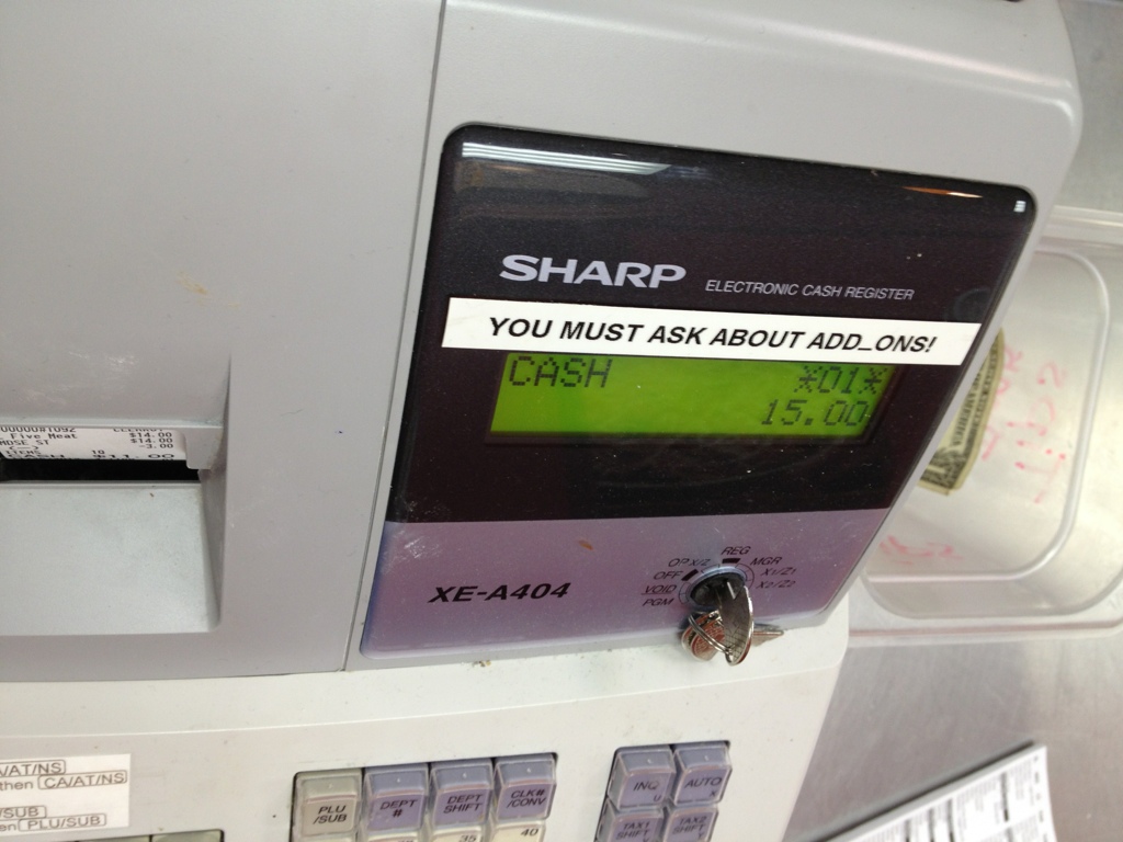
Fun with Labels
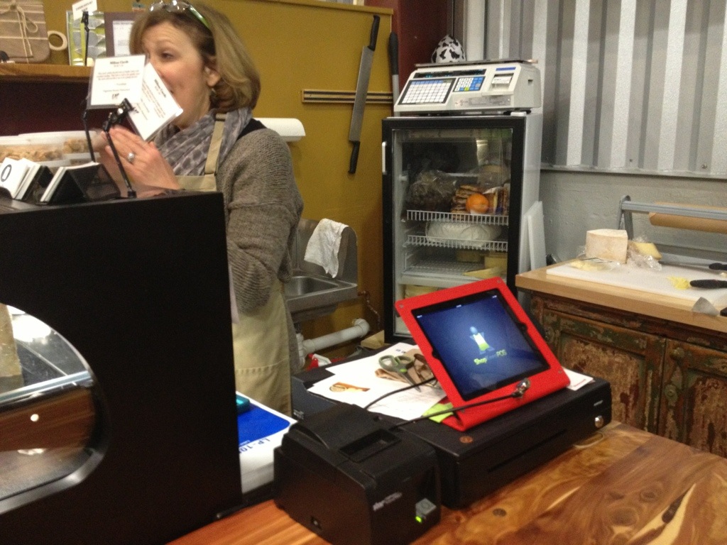
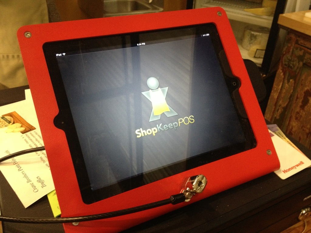
Another iPad POS
Worst. Brand. Name. Ever.
Handwritten Notes
I have been using InVision to do some prototyping at work. I signed in the other day and received an email soon after.

Our home mailing addresses have been published in phone books for decades. But today we've got a heightened sense of privacy concerns and are somewhat more squeamish sharing personally identifiable information. I asked my office mates if they would reply: "No", "Nope", "No way". I did it anyway.
What can I say? I was curious. And I don't think a lot of spammers/scammers are using Intercom to manage their "customer" interactions. After weighing the issues, I wasn't concerned.
This is what I got:
And this was inside:
I think the handwritten note, even something so small, has only increased in value as the frequency of our putting pen to paper has diminished. It really makes InVision feel like a boutique service.
Speaking of handwritten notes, my wife and I have a friend who has been sending us postcards from places she's lived over the last few years – D.C., Lebanon, South Korea. They are some of my favorite things.
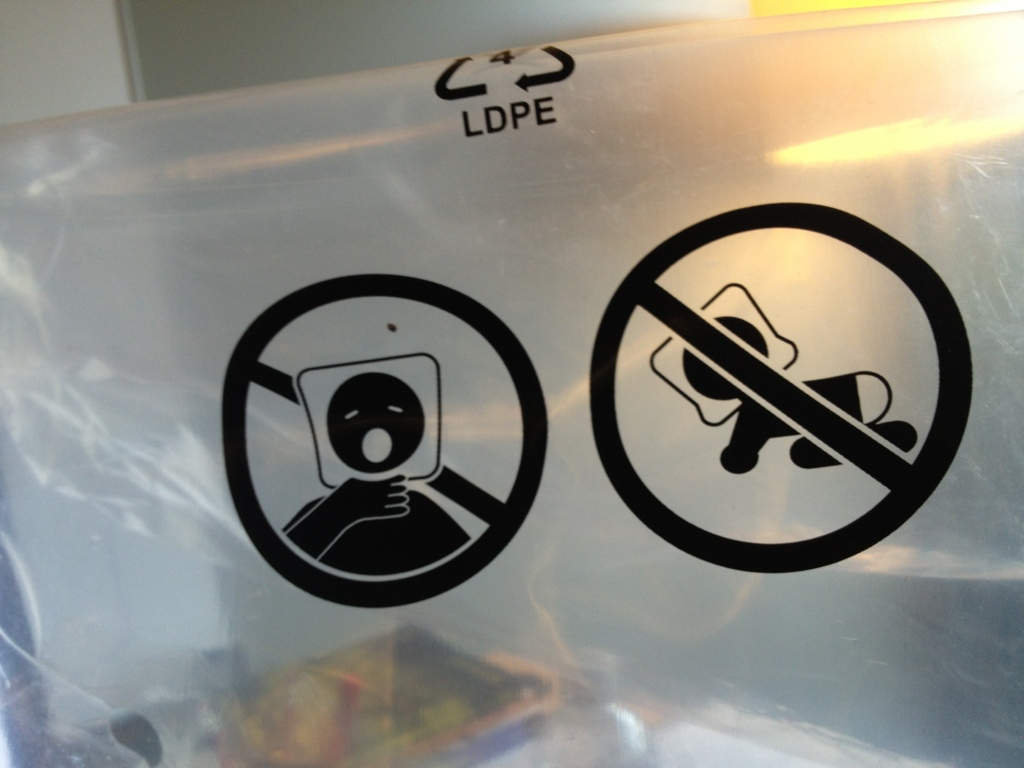
Heads in Bags
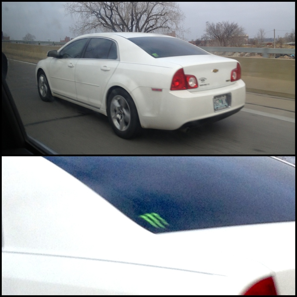
Brand Identity
Touchpoints Exposed
Global Compliance
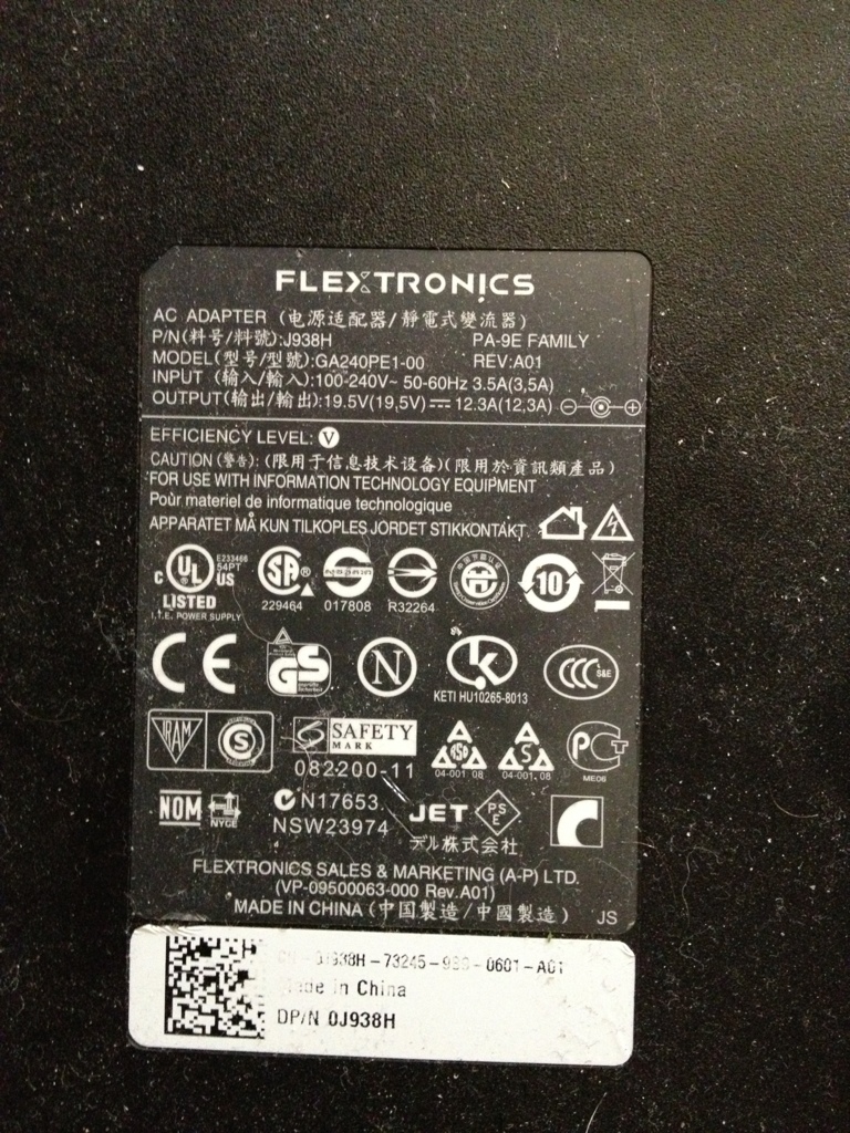 The hieroglyphics on most electronics is a very visible result of the complexities of a global economy with strong consumer protections. Some explanations here: http://www.apartmenttherapy.com/deciphering-the-power-label-on-your-ac-adapters-168405
I would venture to guess that most people would be just as happy without them plastered on all their stuff, but they do probably provide a vague sense of legitimacy. Perhaps they are even interpreted as stamps of quality, much like the East India Trading Company's symbol: "It served as both a guarantee of quality and to ward off thieves and pirates." - http://pirates.wikia.com/wiki/East_India_Trading_Company
Complexity Sells
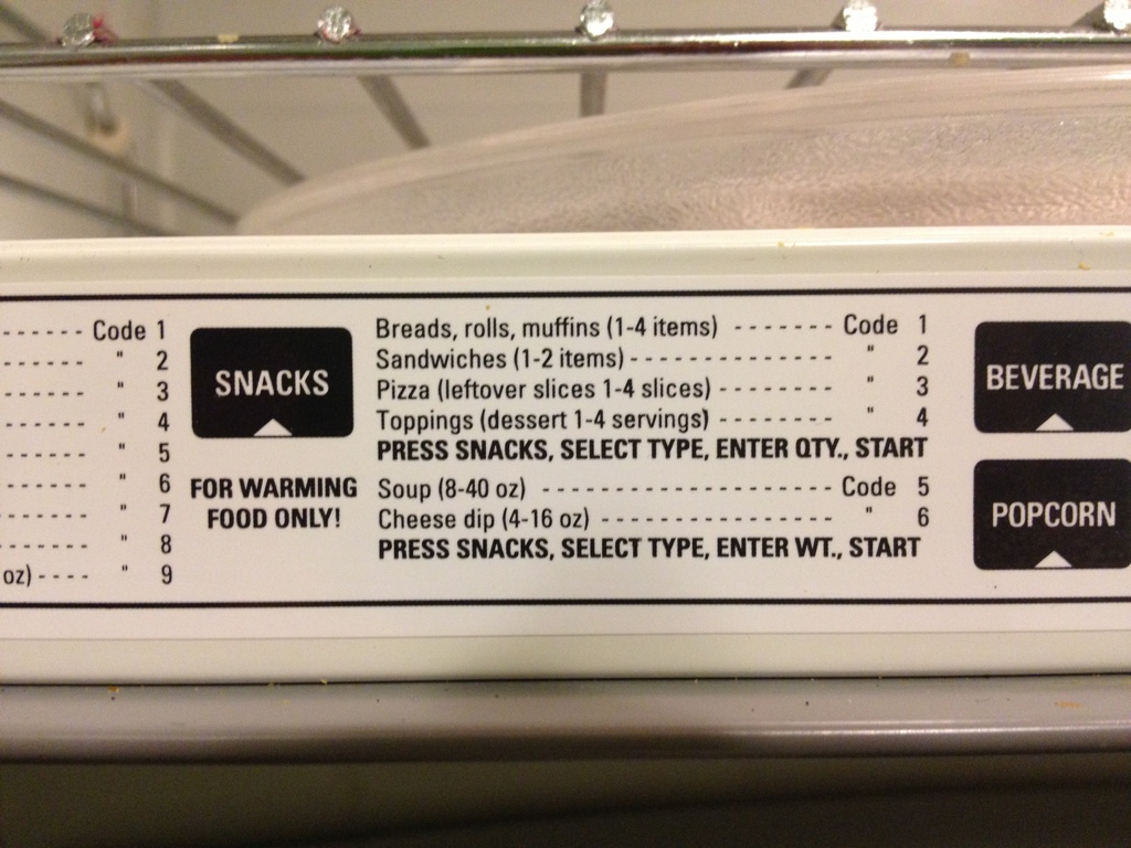 Obviously, the seemingly helpful instructions printed on many microwaves is never actually consulted when using the appliance. The way it's written, it seems to be intentionally adding complexity to rather unambitious goals, like heating up some leftover pizza. This, of course, is to sell microwaves. In practice, people ballpark it, check to see if their food is sufficiently warm, and repeat if necessary. Some microwaves, marketed toward cafeteria managers, are the very model of simplicity. One dial for setting the time. That's it. It turns on when you turn the dial. The world would be a better place with more interactions like that.
Transitional POS
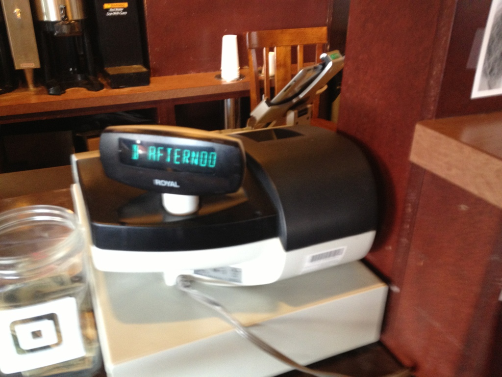 Behind the cash register at my neighborhood coffeeshop is an iPad using Square to process credit/debit transactions. The register is just a glorified cash box at this point. Though it also (perhaps unintentionally) serves as a visual cue for where to place and pay for orders. It's a big, symbolic piece of hardware that says "transaction" like no iPad ever will. What universal symbols can we use in place of a hulking cash register for brick and mortar businesses that are slowly abandoning them?
Banking Alternative
WiFi Network Names
How do people choose to name things when the names will be seen by others? In the case of WiFi network names, only people in the immediate vicinity will be able to see it. Often, this means your neighbors. This example demonstrates a number of different motivating factors that go into the name: convenience (using the default name), humor, ease of identification, and self-identity among others.
Heads Covering Content
What was the first example of heads covering content on magazine covers? You can see here that People uses the technique judiciously, only covering the iconic People logo, whereas Women's Edition is creating ambiguity by cutting off non-iconic text.


