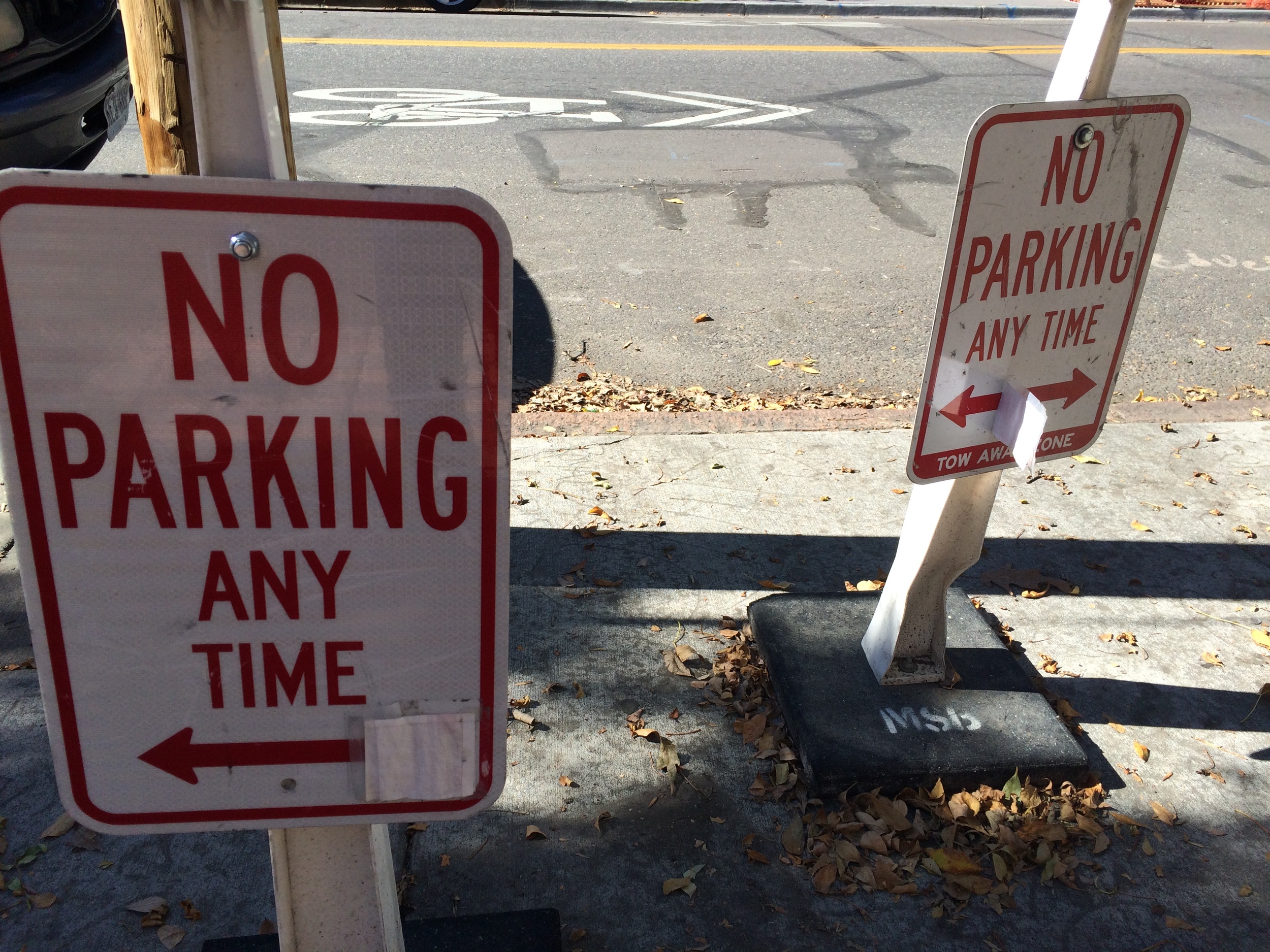
This sign has seen better days, probably a clue that it's been successful. I'm curious whether the highlighting was in the original or was added later.


Analog Dynamic Signage

Trust, Tone, and Selfish Apps
Carousel, like Spotify and several other apps, use storage space on your phone to decrease the amount of data that must be transferred while using the app, thereby saving money and improving the user experience. Different apps allow different levels of cached data management. For example, Tumblr allows you to "smash" the cache, deleting it entirely, whereas Spotify has no way for the user to manually remove the app's cache without deleting the app and reinstalling, a workaround at best. Spotify would like their users to simply trust that their supposedly intelligent data management algorithms will automatically make space available when storage is getting low. However, these algorithms are rather selfishly inward looking, as far as I can tell. The cache is only reduced when that app is attempting to write data and can't find the space available. It's like your roommate taking up space in the fridge and then only throwing their moldy leftovers away when they need room for more of their own groceries. No awareness of the needs of others! It's a technical limitation, but still quite rude behavior. Carousel has anticipated this and employed a clever technique of placating the user. I have an idea of how selfish they're being, but I still felt a bit better about it after seeing this screen used to manipulate us into complacency.

Marketing-Driven Products
This is water. In a can.

Attrition
I overheard a conversation between a couple of designers on the train this morning. They work at the same company. One has been in his current position for about two and a half years. The other indicated that she was a more recent hire. They were discussing other places they've applied to in the past. A pretty mundane conversation, but they were using a peculiar term to describe their time spent in an organization. One spoke of a well-known organization that neither had worked at to date...
"I don't know if I'll ever run through that place."
A bit later, the other spoke of an industry she had not yet worked in...
"I've thought about doing a run through an advertising agency just to get a view of that world."
The term "run" speaks to a certain culture around employment in design right now, and perhaps more specifically, digital product design. That culture seems to favor relatively short stints and variety of experience over depth. Having been in my current position for 4 years, I've found the depth of experience with a large and complex project to be very rewarding. I've been able to see the ship turn, as it were.
It's one thing to move from project to project with different organizations after those projects are "complete". To me, that shows that a person has a sense of commitment and values follow-through. I wonder how one could attempt to uncover a potential hire's true feelings around commitment. I wouldn't want to work with someone who thinks about skating every time stuff gets real.
Surprise and Delight
Others have commented on the GIFs automatically generated in Google Photos. I'd like to echo their sentiments. Real surprise and delight that leaves someone smiling is difficult to achieve in digital product design. We're essentially asking robots to do something very human. I took photos at my friends' wedding and here's the moment that Google "chose" to animate...
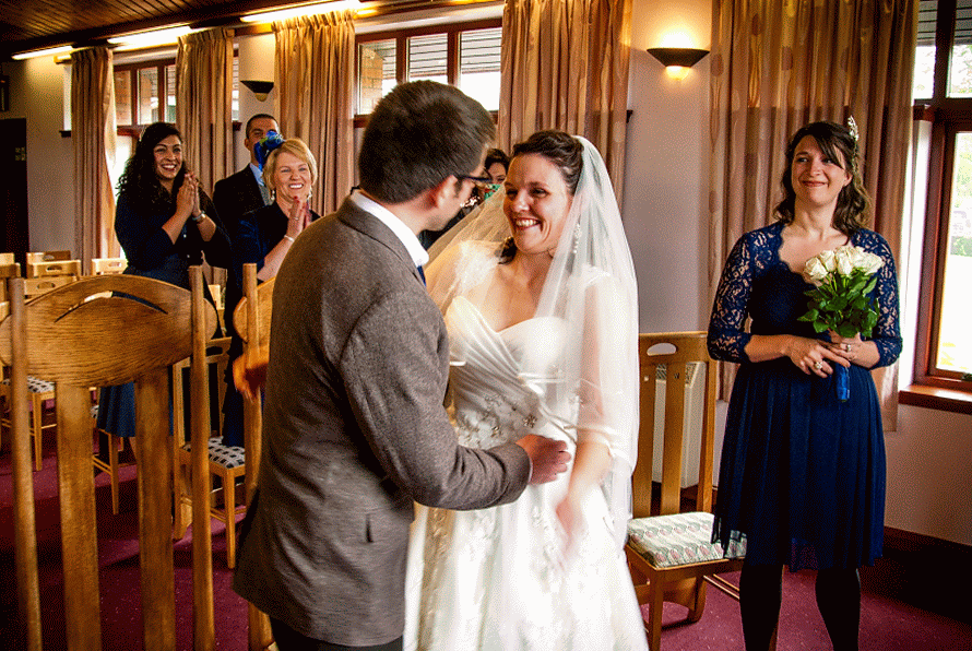
If that's not delightful, I don't know what is.
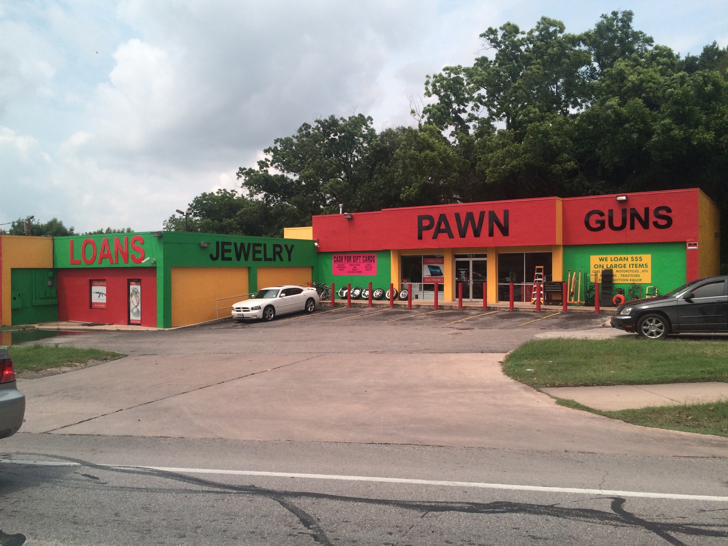
Automotive Scale
Seems a good example of architecture at automotive scale as described on the Human Scale Wikipedia entry.
A pedestrian steadily walking along a 30-metre (100 ft) length of department store can perceive about 68 features; a driver passing the same frontage at 50 km/h (14 m/s; 31 mph) can perceive about six or seven features. Auto-scale buildings tend to be smooth and shallow, readable at a glance, simplified, presented outward, and with signage with bigger letters and fewer words.
Mail App Comparison
The Gmail app is the only one that alters the presentation of content for mobile devices. Interestingly, the team behind Inbox, another Google mail app, chose not to do that.

Screenshots of 4 different iOS mail apps
Idea Generation
I've found that some of the best outcomes come from, counterintuitively, accidents. The adjacent possibilities that we often unwittingly limit ourselves to are the obvious and already visible ones. They come from inside our heads. We have already had previous experiences that provide us with a library of possibilities. However, no matter how many experiences we have had, there are always vastly more possibilities that reside in darkness, outside of the realm of our experience. In fact, through Jan Chipchase's conception of the learning curve ("A Year of Reflection"), we see that our experiences actually open us up to an ever-increasing pool of adjacent possibilities. The more we see, the more we know is out there that we can't yet see. The trick is in finding ways of accessing these currently invisible possibilities. And yes, it's scary, because the unknown is always scary (or perhaps seemingly irrelevant, which is probably the more dangerous of the two sentiments).
When it comes to design, allowing oneself some room to play, to just do things that don't seem relevant or productive, allows you to punch into the darkness and feel around a bit. It's true that most of that kind of exploration may be seen as fruitless, but every once in awhile, you'll trip over a gem more valuable than anything under the lamppost of your previous knowledge.
Make it look intentional

Someone decided to have signage on the train be displayed on non-rectangular backgrounds. However, the shape is not distinct enough from a rectangle, so the result is an optical illusion that comes off looking like the sign isn't adhering to the wall very well. Moral of the story, if you're going to deviate, really do it.
Create Once, Publish Everywhere
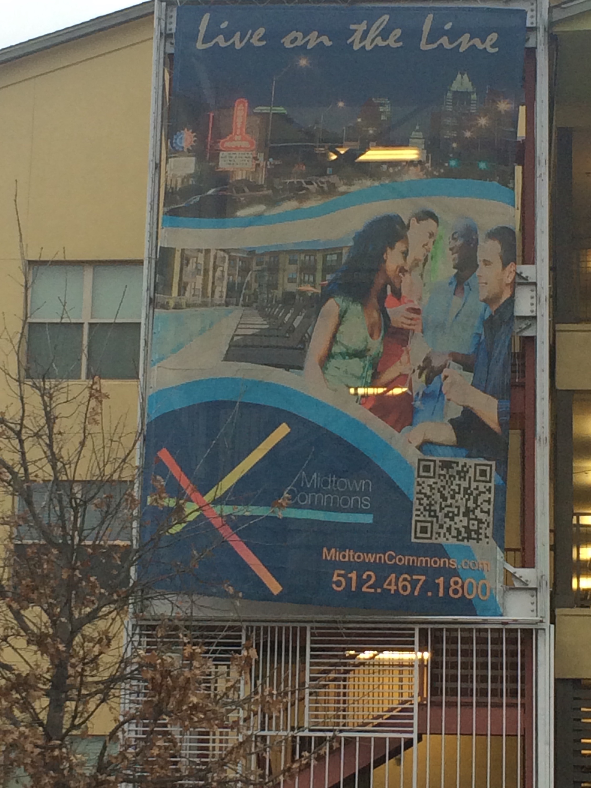

A giant banner flapping in the wind and hanging from the side of a building is probably not the best use of a QR code. My guess is that this image was created as a poster and was then blown up when it was decided to put this up. Or it's just another example of thoughtlessly employing [dying] trends in the constant pursuit of relevance.
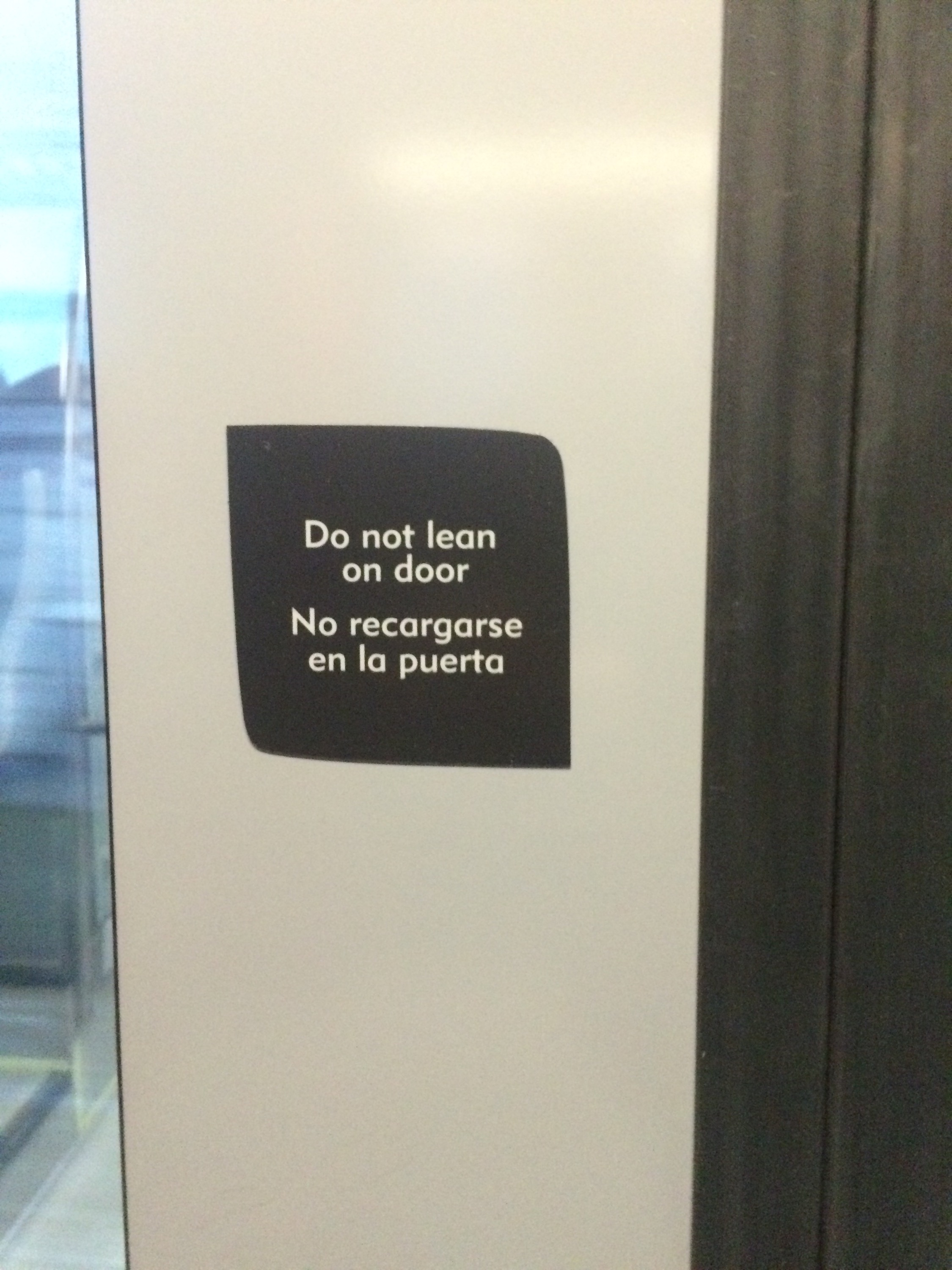
Bolt-On Accessibility

How to make accessibility a native consideration in product development? As it stands, the world is always being retrofitted to allow more people to engage in it.
We've got standards. We've got a culture of empathy among designers. What we are missing is economic incentive for businesses to incorporate the standards into products upfront. Rather, there are niche businesses and government departments who are tasked with crudely pasting the standards on top of our surroundings.
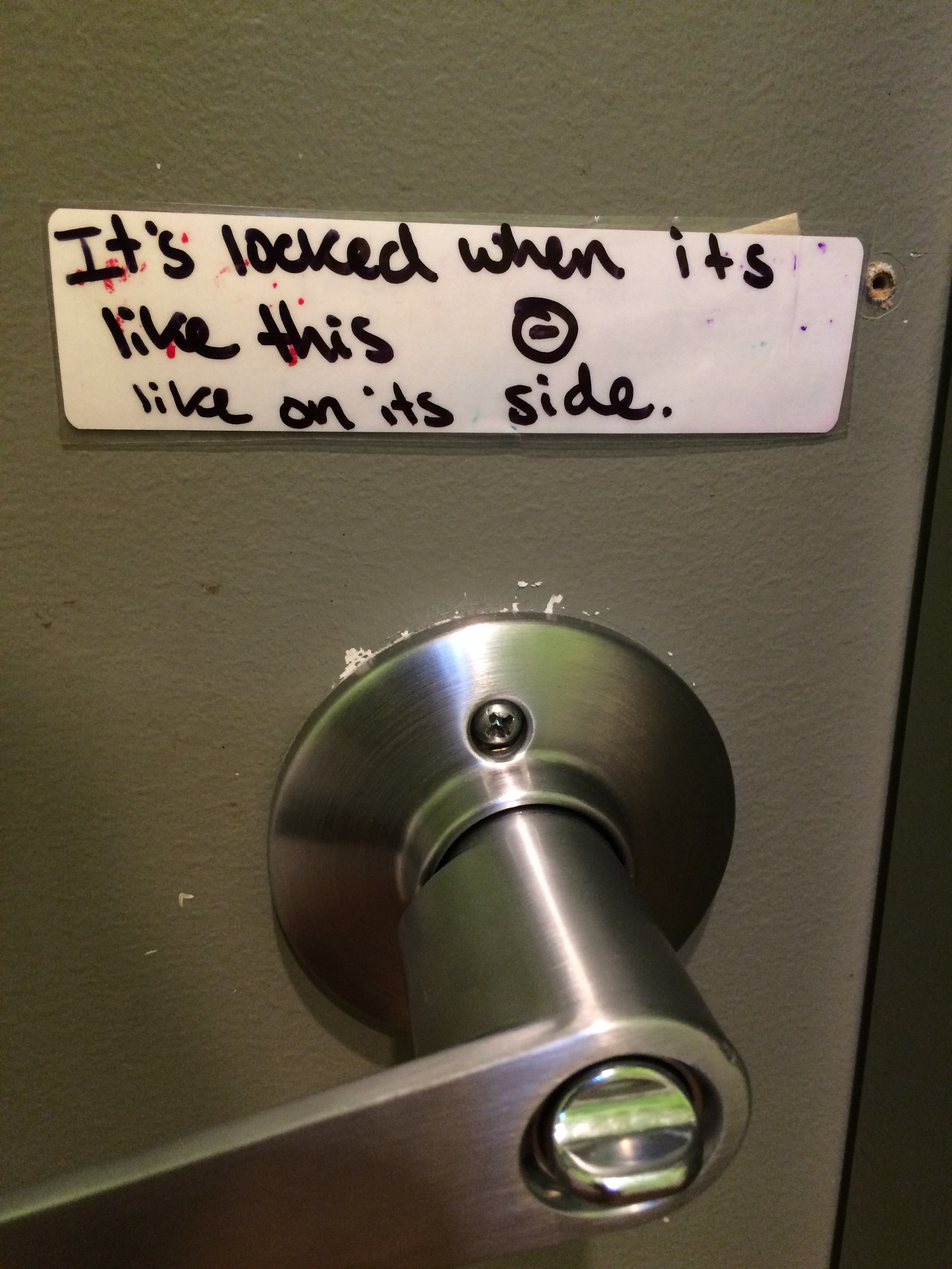
Like on its side
I really appreciate the use of pictorial description inline with text.
Recycling Symbol(s)
The recycling symbol, like most things, is not universal. Taiwan's recycling symbol is printed on the side of this can of apple soda. Though you can find lots of people online commenting on the clever use of negative space, also forming arrows, I wasn't able to find out who designed it (I even used Google translate to get the Chinese versions of my searches). Oh well. Kudos anyway to this Taiwanese graphic designer toiling in anonymity.
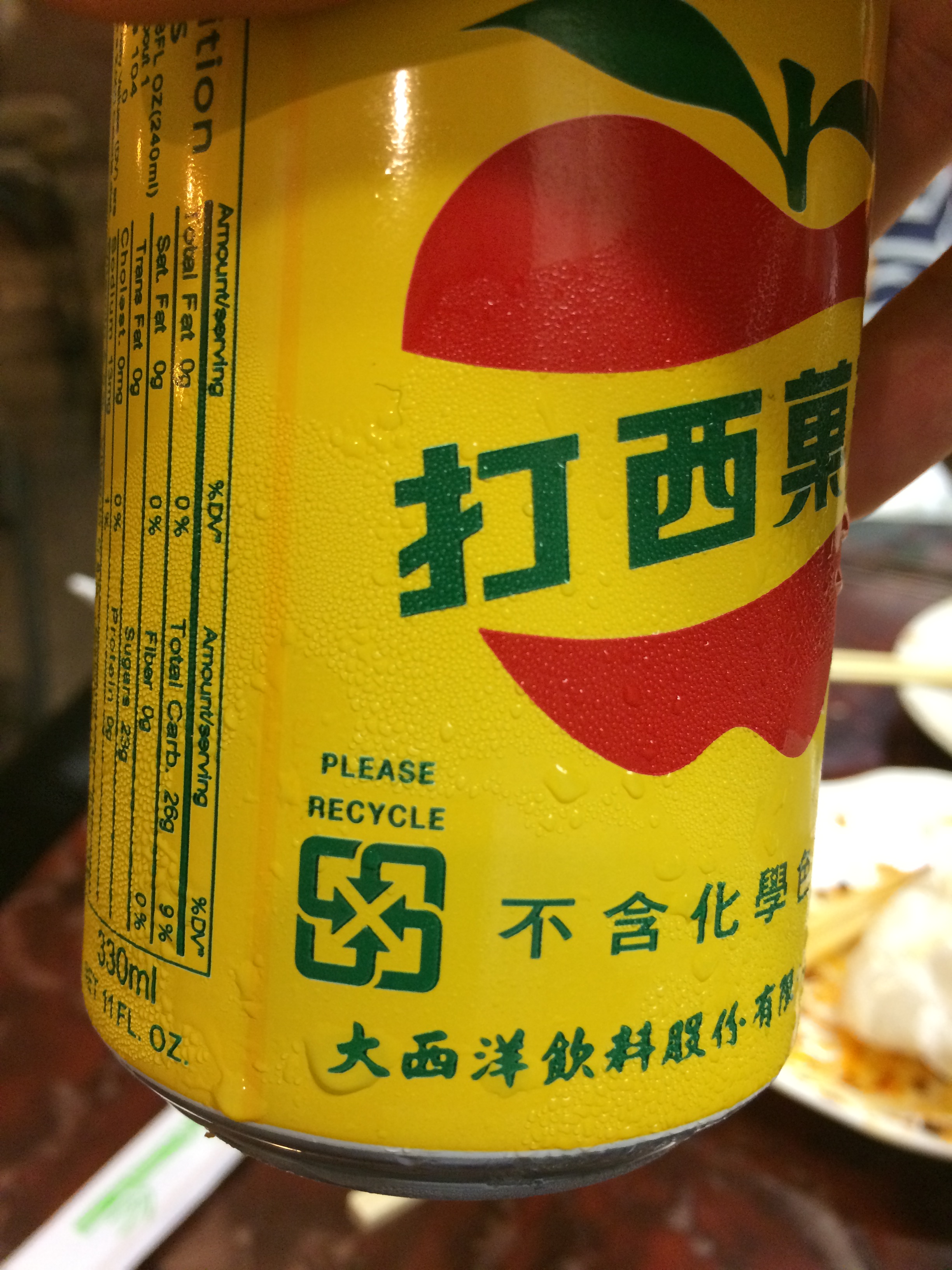
Can of apple soda with Taiwanese recycling symbol
Image Choice
 Excellent image choice for the Airbnb homepage. Yes, the person sleeping in the morning light conveys a sense of peace and comfort inline with the recent rebranding. But it is also very cleverly chosen by the web designers/developers for another reason.
Like many others these days, the site employs various progressive loading techniques to speed up perceived load times, an important metric that keeps users happy and clicking. The big area at the top of the site displays a looping series of video clips. However, before the video clips begin, a still image is displayed because it's a smaller file that can be delivered from the server and presented to the user much faster. The still image is the first frame of the first video clip, so when the video begins, it appears as though the image has come to life. If this vivification is simply a person waking up in the morning, the user doesn't perceive it as a jarring transition in the way you would if the image were an action shot—someone in mid-stride, for example.
Awesome, subtle piece of design.
The Grocer's Taxonomy 2
 "Tofu Snacks" are a subset of "Snacks" and yet they are displayed as peers. Seems to be a matter of available space on each side of the aisle. Also possibly the result of translation. Or perhaps just poor organization.
Communicating Commitment
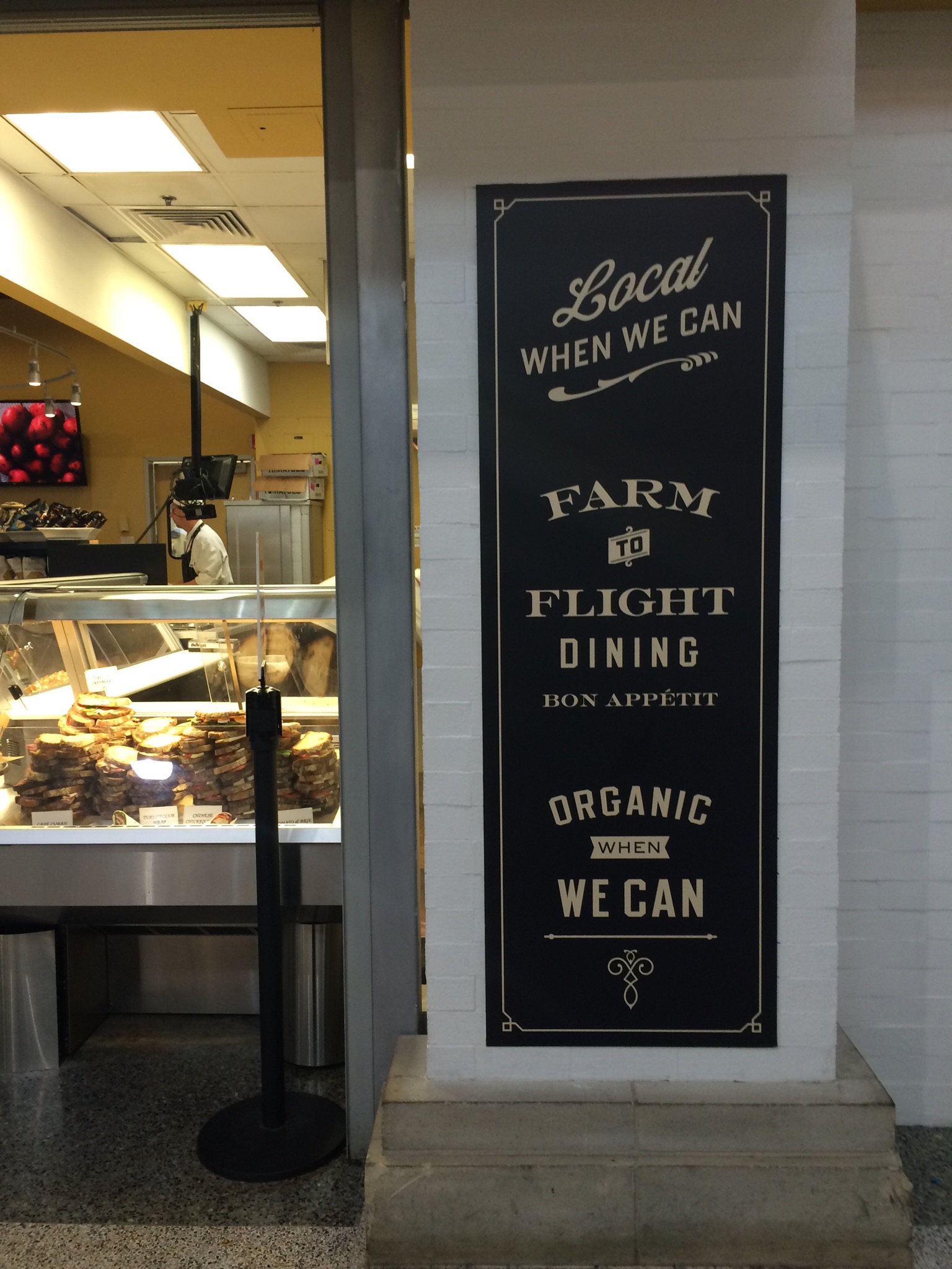 ... when we can.
The Grocer's Taxonomy
 What makes it on the board? Especially interesting in the "ethnic" section.
Transitional Behaviors
With the current mix of technologies, lots of people prefer to access media through their smartphones. However, lots of those same people don't yet have a car that allows them to pipe audio on their device through their car speakers. So, we get a transitional behavior: wearing headphones while driving a car.
Austin is great
