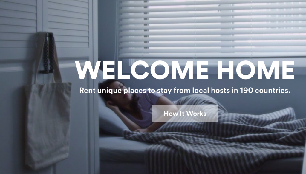
 Excellent image choice for the Airbnb homepage. Yes, the person sleeping in the morning light conveys a sense of peace and comfort inline with the recent rebranding. But it is also very cleverly chosen by the web designers/developers for another reason.
Like many others these days, the site employs various progressive loading techniques to speed up perceived load times, an important metric that keeps users happy and clicking. The big area at the top of the site displays a looping series of video clips. However, before the video clips begin, a still image is displayed because it's a smaller file that can be delivered from the server and presented to the user much faster. The still image is the first frame of the first video clip, so when the video begins, it appears as though the image has come to life. If this vivification is simply a person waking up in the morning, the user doesn't perceive it as a jarring transition in the way you would if the image were an action shot—someone in mid-stride, for example.
Awesome, subtle piece of design.