WiFi Network Names
How do people choose to name things when the names will be seen by others? In the case of WiFi network names, only people in the immediate vicinity will be able to see it. Often, this means your neighbors. This example demonstrates a number of different motivating factors that go into the name: convenience (using the default name), humor, ease of identification, and self-identity among others.
Heads Covering Content
What was the first example of heads covering content on magazine covers? You can see here that People uses the technique judiciously, only covering the iconic People logo, whereas Women's Edition is creating ambiguity by cutting off non-iconic text.
Push Button for Emergency
No Falling Allowed
Hand Made
Surreal Mapping
Packaging Roundup
Small Delights
Up, Off, Down, On
 This may be evidence of the difficulty of getting things done within some institutional settings. Someone was willing to create rather high quality signage for what amounts to a simple wiring mixup. Either they don't know it can be easily fixed or they've had one too many run-ins with the facilities manager.
Gas Pumps Are So Silly
EDIT (Sept. 10, 2012): I was told that the gas company supplies them. I wonder how much variation exists across particular brands. BP seems to be very consistent and usually provides the smoothest interaction. END EDIT
The "Regular | Special | Super +" sign at the bottom does little aside from telling people what you can get out of this pump. Where do you think you push to actually select your grade of fuel? No, it's not the yellow sticker that says "PUSH TO START". It's the much less prominent colored areas above. It looks like any of these areas are programmable, but someone made the decision to only allow interaction with one of the potential choices (and they chose the less obvious one).
The screen the walks you through each step is divorced from the keyboard necessary for user input, so much so that a sign is needed to tell users about it.
There are three separate signs regarding payment, in three separate corners, in three very different styles, two of which are potentially confusing. Confusing sign #1: "BANK DEBIT CARDS NOT ACCEPTED". Since most (I'm guessing all, but I should confirm) debit cards can be run as credit, this is not quite correct from their customer's perspective. Confusing sign #2: "PRE-PAY ONLY...". This one can only be appreciated by viewing the image. The overwhelming message is that this pump is pre-pay only. However, after more investigation... cart was placed before the horse.
Where are these flexibility constraints coming from that put the interaction design onus on the convenience store owners? I've rarely, if ever, seen a place that offers more or less than 3 grades of gasoline. There seems to be no explanation for the variation across pumps.
Safety and Humor
 When can we be playful with the representation of safety? These illustrations are fun, but they are of serious subject matter. I'm reminded of Air New Zealand's in-flight safety video featuring flight attendants in body-painted uniforms. Engaging or distracting?
Usability Compromises
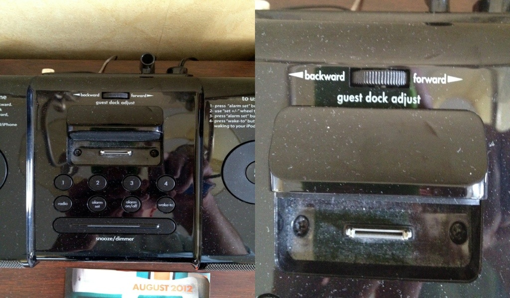
 This iHome clock radio is a wealth of compromises that put fashion first. The one shown above is a dial that allows the user to move a device support mechanism back and forth. However, the dial itself goes side to side, breaking the natural mapping and requiring additional labeling. There are any number of reasons why this may have been done: symmetry, ease of production, likely position of the hand using the dial, laziness, etc. It would be great if product development teams could find a way to incorporate appropriateness alongside beauty.
Legacy Handmade Signs
Last Gasps of a Dying Market
Contextual Signage
The U-Haul signage, on the van itself and at the key drop, was much more friendly and helpful than the dealer. The dealer had a sign too, next to a couple of large birdcages warning people that "Both birds will bite."
E-Textbooks
 We're still in that transition period where it's novelty rather than an expectation to purchase digital books. The longstanding criticism of the textbook publishing cycle is that new versions don't actually include new material, or enough to justify the new edition. I wonder if textbooks might simply be 'updated' in the future rather than published over and over again in total.


