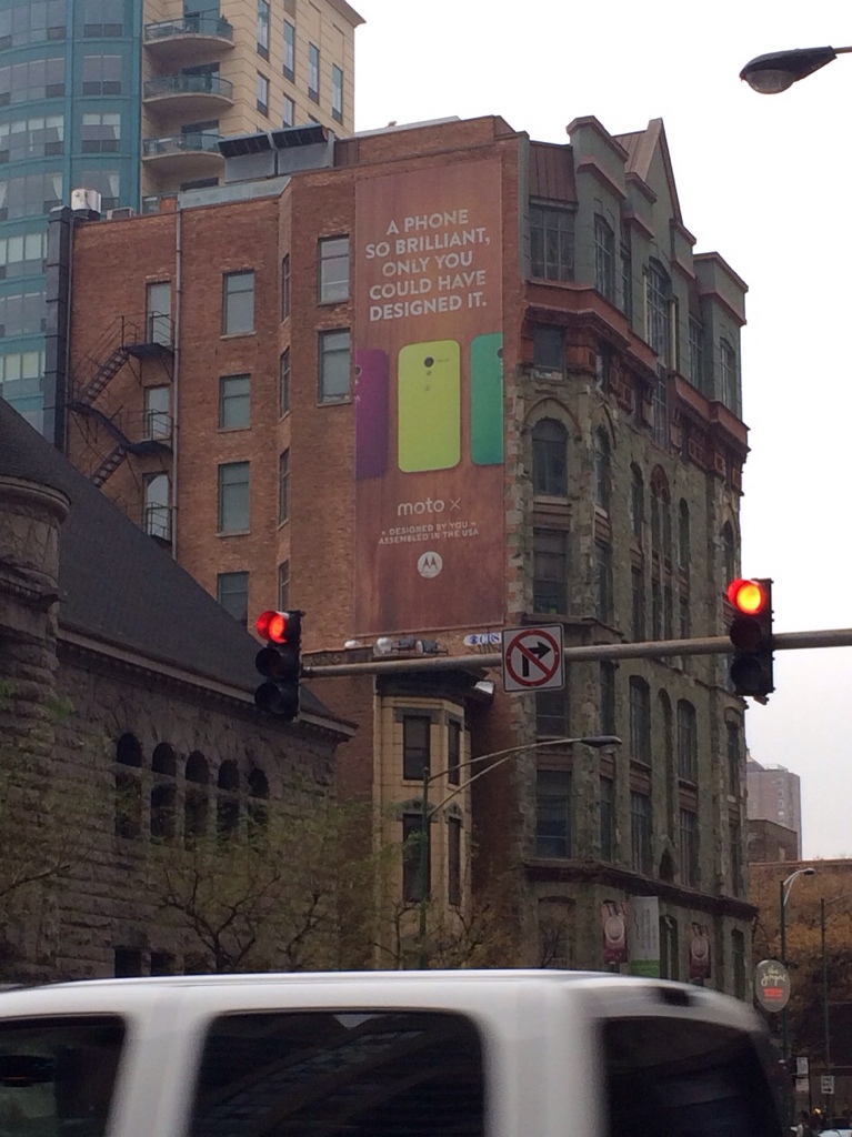
Designed by You
The Lowest Price
 Regular gas without ethanol, which has long been the more expensive option compared with the blended mid-grade fuel, is being phased out in Iowa. But that only partially explains this little handwritten sign. Those who really care about getting the cheapest gas are always going to scan the prices, even if it's mostly habit to grab for one or the other. Was this the value they thought they were creating? Just a "hey, pal"?
Recycled Language
 "Keep Calm and Carry On" has been appropriated for all manner of commercial purposes. Is it simply distance through time that allows cultural artifacts like this to lose their original significance? How long until you can slap the consoling slogan of a war-torn nation onto the side of a burrito bag?
From Wikipedia:
The poster was initially produced by the Ministry of Information, at the beginning of the Second World War. It was intended to be distributed in order to strengthen morale in the event of a wartime disaster, such as mass bombing of major cities using high explosives and poison gas, which was widely expected within hours of an outbreak of war.
Intentional Misinformation
Simulacrum in Architecture
 I believe this structure is referred to as a pole barn. This particular one is a simulacrum of a more traditional farmyard barn. Tacked to the sides are entirely decorative panels made to look like barn loft doors. And on top, two weathervanes, pointing in two different, wrong directions. This building is set back off the street by a longish driveway and nothing is even immediately next to it. Why the kitschy, sentimental, decorative elements for a building that is so removed?
Knock-Offs
Service Expectations
 Dining out in a foreign country can give you loads of insight into the local culture. On my first trip to Asia, and South Korea specifically, I encountered a different expectation of service. Servers wait to be called over to take your order rather than asking if you are ready. Some places, especially those that may require lots of mid-meal requests, like the Korean barbecue joints, have buzzers on the tables. Not unheard of Stateside, but certainly more common in Korea. I wonder how this expectation translates across other industries, if at all.
Symbols in Braille
 The braille in this picture simply reads "#1". Probably unintentionally, the thick, vertical line separating the star symbol and the braille text is illustrative of the gulf between people who are blind and the vast world of iconic representation. I love this sign because the symbol is also raised, able to be felt by hands probing the surface for messages. I'd rather the meaningless line not be there, but the raised star still provides some opportunity to connect the dots... I couldn't resist.
Archetypes
Fun with Labels
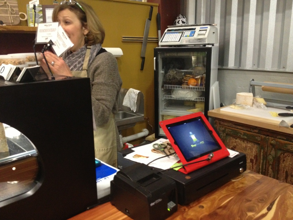
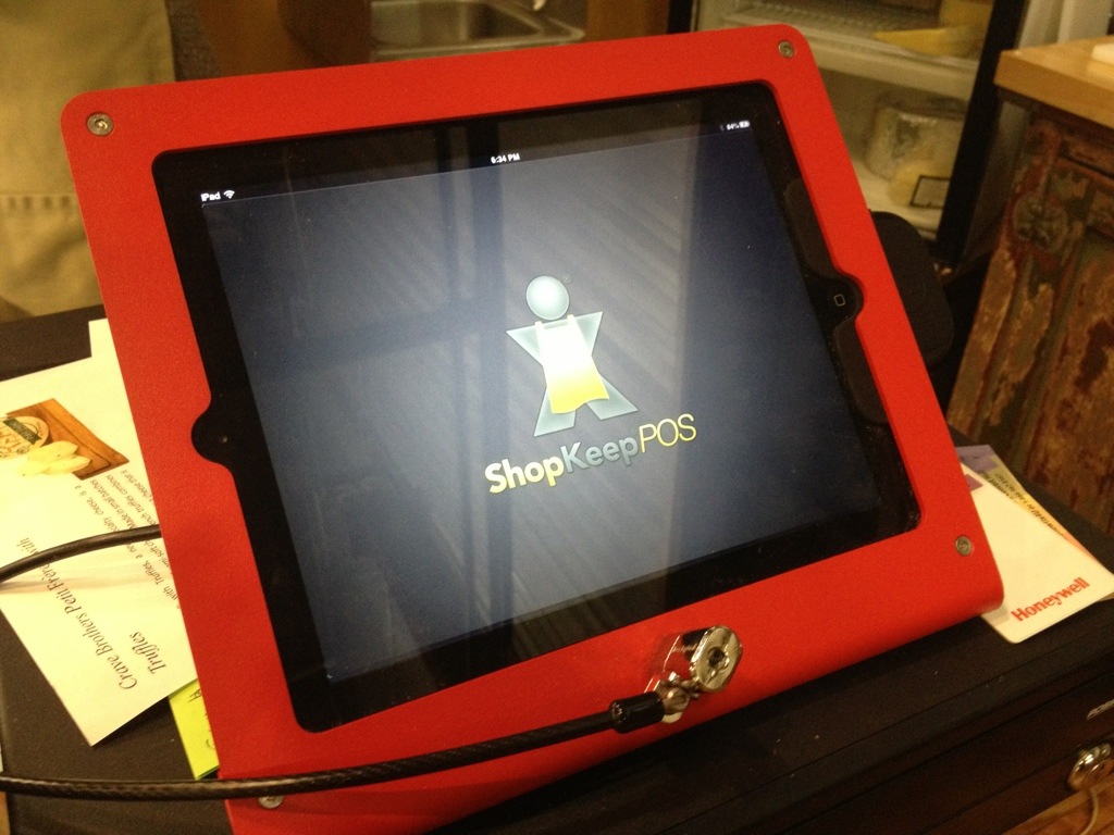
Another iPad POS
Worst. Brand. Name. Ever.
Handwritten Notes
I have been using InVision to do some prototyping at work. I signed in the other day and received an email soon after.

Our home mailing addresses have been published in phone books for decades. But today we've got a heightened sense of privacy concerns and are somewhat more squeamish sharing personally identifiable information. I asked my office mates if they would reply: "No", "Nope", "No way". I did it anyway.
What can I say? I was curious. And I don't think a lot of spammers/scammers are using Intercom to manage their "customer" interactions. After weighing the issues, I wasn't concerned.
This is what I got:
And this was inside:
I think the handwritten note, even something so small, has only increased in value as the frequency of our putting pen to paper has diminished. It really makes InVision feel like a boutique service.
Speaking of handwritten notes, my wife and I have a friend who has been sending us postcards from places she's lived over the last few years – D.C., Lebanon, South Korea. They are some of my favorite things.
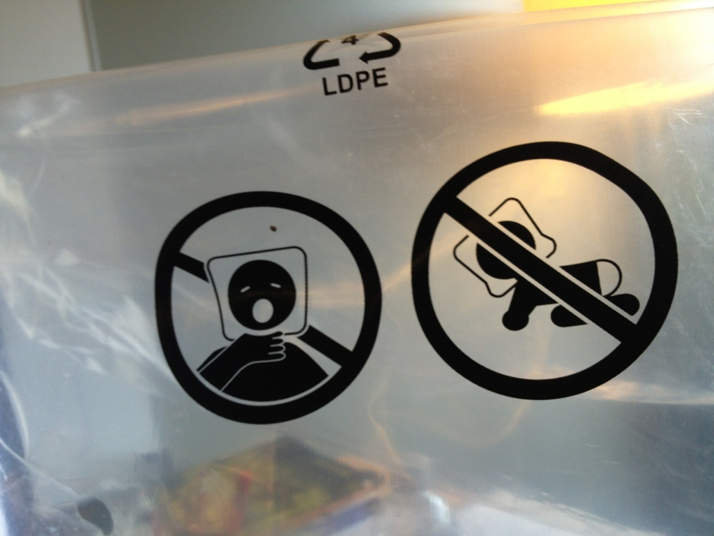
Heads in Bags
Brand Identity
Touchpoints Exposed
Global Compliance
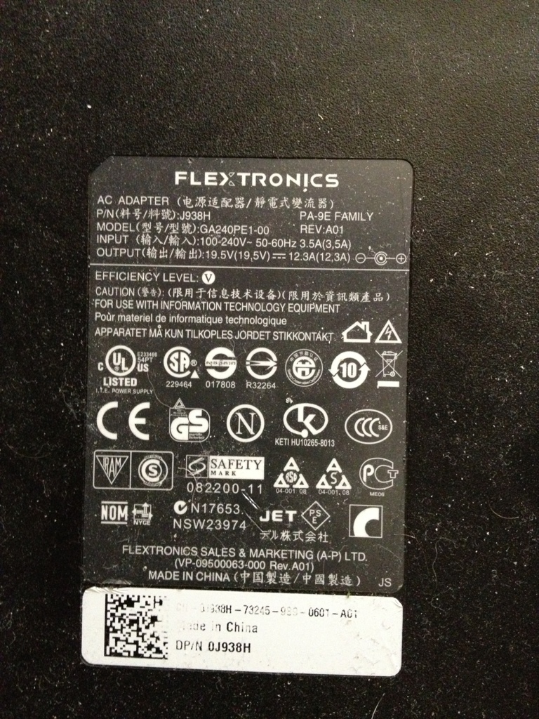 The hieroglyphics on most electronics is a very visible result of the complexities of a global economy with strong consumer protections. Some explanations here: http://www.apartmenttherapy.com/deciphering-the-power-label-on-your-ac-adapters-168405
I would venture to guess that most people would be just as happy without them plastered on all their stuff, but they do probably provide a vague sense of legitimacy. Perhaps they are even interpreted as stamps of quality, much like the East India Trading Company's symbol: "It served as both a guarantee of quality and to ward off thieves and pirates." - http://pirates.wikia.com/wiki/East_India_Trading_Company
Complexity Sells
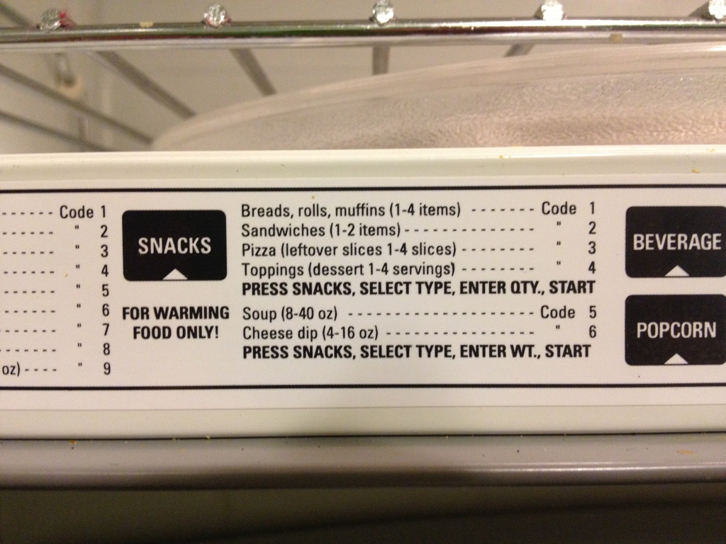 Obviously, the seemingly helpful instructions printed on many microwaves is never actually consulted when using the appliance. The way it's written, it seems to be intentionally adding complexity to rather unambitious goals, like heating up some leftover pizza. This, of course, is to sell microwaves. In practice, people ballpark it, check to see if their food is sufficiently warm, and repeat if necessary. Some microwaves, marketed toward cafeteria managers, are the very model of simplicity. One dial for setting the time. That's it. It turns on when you turn the dial. The world would be a better place with more interactions like that.
Transitional POS
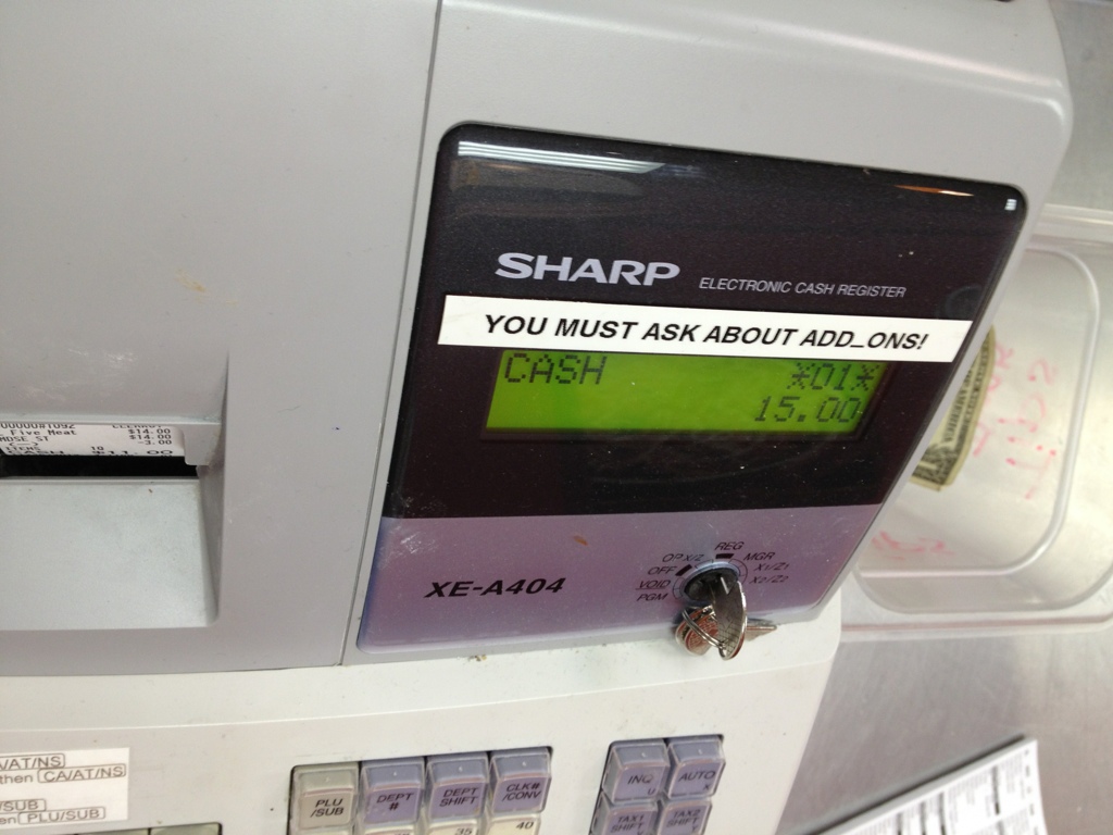
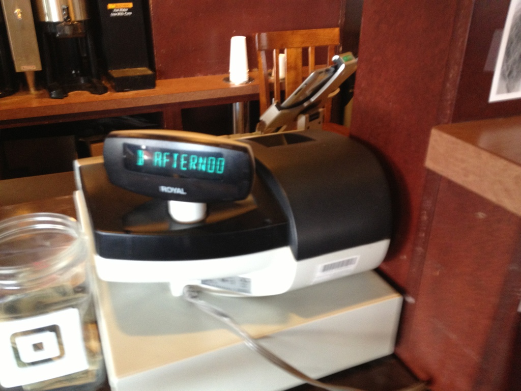 Behind the cash register at my neighborhood coffeeshop is an iPad using Square to process credit/debit transactions. The register is just a glorified cash box at this point. Though it also (perhaps unintentionally) serves as a visual cue for where to place and pay for orders. It's a big, symbolic piece of hardware that says "transaction" like no iPad ever will. What universal symbols can we use in place of a hulking cash register for brick and mortar businesses that are slowly abandoning them?
